Via KQQQ:
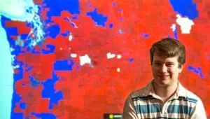
A Washington State University graduate student has created what’s believed to be the first of its kind election map that details voting down to the neighborhood. Economics student and cartographer Ryne Rohla compiled voting data from 175,000 precincts from last Fall’s presidential election. Rohla’s detailed interactive map probes deeper than just red and blue states and reveals deep red and deep blue precincts. The deeper the red, the more people voted for Republican Donald Trump. The deepest blue on the map locates Democrat Hillary Clinton’s strongest support.
Rohla’s map reveals the nation’s intensifying split between Republican rural America and the Democratic strongholds in the cities. His research also discovered that the outer suburbs shifted more Republican last Fall voting more like rural areas. The map also reveals clusters of 3rd party support in college towns. For instance, Green Party candidate Jill Stein performed well near Western Washington University and the University of Oregon. While on the other end of the spectrum, Libertarian Gary Johnson did best near the University of Idaho and Eastern Washington University.
Rohla’s map was posted online in March at a volunteer-run election data tracker group’s site called Decision Desk HQ. His map was so popular that it crashed within an hour after drawing more than 7,000 views. Rohla is now getting calls from institutions like Stanford asking about his research.
The WSU student did all this work on his own time and with no aid or outside funding. He plans to use the data in 2 of his 3 doctoral papers at WSU. You can view his groundbreaking map here http://rynerohla.com/index.html/election-maps/2016-presidential-general-election-maps/
I’ll have a separate post about this.